Date
July – August 2023
July – August 2023
Role
UI/UX designer @ Weibo
UI/UX designer @ Weibo
Tools
Photoshop, CSS, HTML
Photoshop, CSS, HTML
Location
Shanghai
Shanghai
01 | Context
What’s Weibo?
Weibo is one of the most popular microblogging platforms in China, founded in 2009. It serves as a significant platform for news dissemination, entertainment, and public discussion, playing a critical role in shaping and reflecting public opinion in China.Project Overview
For the past two years, Weibo, in collaboration with its corporate partners, has been dedicated to enriching educational opportunities for children in underdeveloped regions of China. The "Love Library" charitable initiative serves as a bridge between users and educational resources, facilitating book donations to schools in need.02 | My Role
As the UI/UX designer on the team, my task was to redesign and optimize the website to ensure it was visually appealing and functional. I worked closely with the project manager and software team to ensure that the design would be feasible while aligning with
overarching objectives.
03 | Discover
I chose retrospective data analysis to identify patterns and problem points from past user interactions, pinpointing areas of decreased engagement and usability issues. Additionally, I sought feedback from engineers and the product manager to understand technical constraints and practical considerations for implementing new design elements.
2022 Website Design Issues
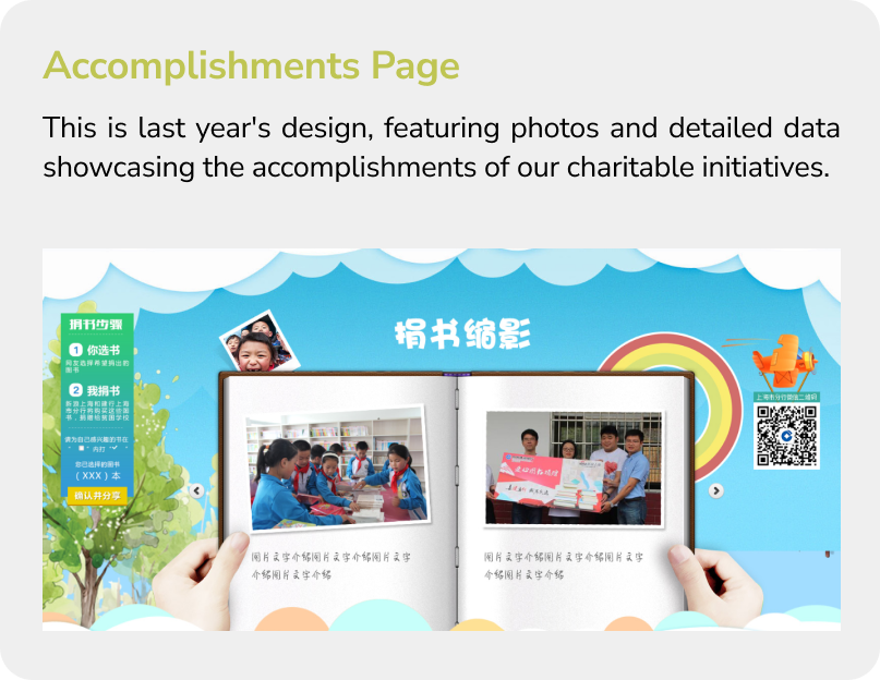 - Not interactive
 - The straightforward data presentation lacked emotional storytelling
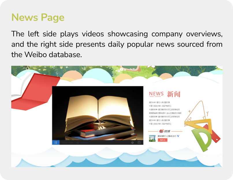
- Irrelevance to charitable mission
- Unrelated content can decrease engagement and donor retention
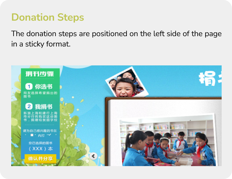
- Not stand out
- Hard to navigate
- Users might miss the sticky sidebar
04 | Define
Design Goals
Foster Community
Building a supportive environment encourages participation and strengthens connections among users.

Support Online Education
Directly enhances access to learning resources, making education more inclusive and available to a wider audience.

Streamline the Donation Process
Removes barriers to giving, making it easier and faster for users to contribute.
05 | Solution
Solution 1: Foster Community
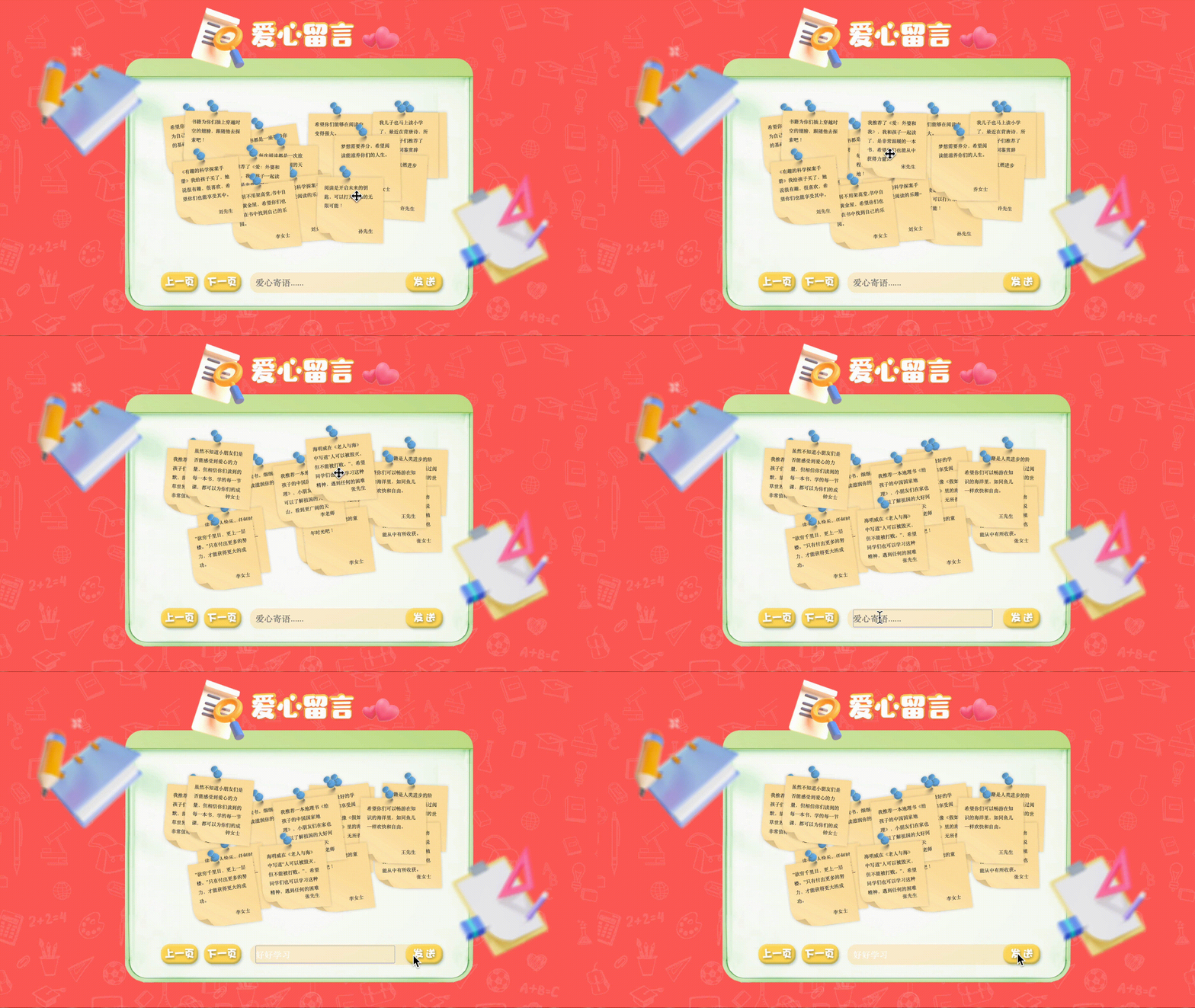
Interactive Message Board
Instead of having the Accomplishments Page, I introduced a new feature — a Message Board. This page enhances community engagement by allowing donors to leave messages. Upon submission, these messages are published onto virtual stickers. Users can interact with these stickers by dragging them across their screens. This feature not only facilitates a more personal connection between donors and recipients—since children can also visit this website to see the messages—but also significantly enriches the user experience by transforming passive viewing into active participation.
Solution 2: Support Online Education

Educational Resources Library
I transformed the original News Page into an Educational Resources Library. The video section now presents informative learning materials, with an introduction to the lecture on the right side, and a 'Past Videos' section for users seeking additional educational content. This change enhances the website's relevance to our educational mission. Moreover, it fosters a community of learners and ensures all educational content is accessible long-term, aligning perfectly with our goals of enriching educational opportunities.
Solution 3: Streamline the Donation Process
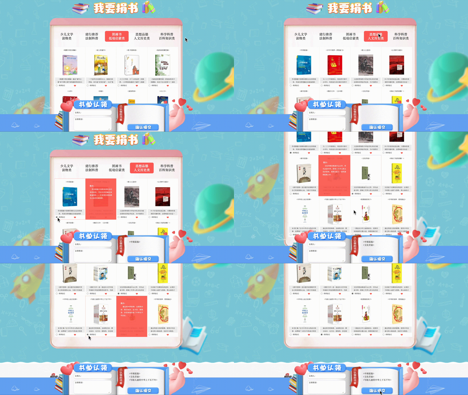
Enhancing Donation Accessibility
Enhancing Donation Accessibility
Previously, the donation button was positioned on the left side of the webpage in a sticky bar, a placement that may have caused users to overlook it and potentially decrease contributions. To improve visibility and accessibility, I have repositioned the donation button to the bottom of every page. Additionally, on the book donation page, users can explore various categories of books. Hovering over each book reveals a red rectangle box with the book's introduction. Selected books are then displayed at the bottom of the page, to the right of the blue book icon, enhancing transparency and ease of tracking throughout the donation process.
06 | Design System
The core foundation of the design system is to align with the mission of the initiative—enhancing educational opportunities. In this case, we opted for a custom elementary school theme.
Color Palette
 .
.  .
.  .
. 
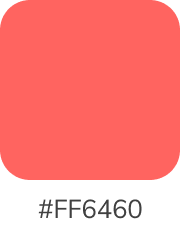
The overall color scheme of this website is vibrant, evoking joy, energy, and growth. These colors are chosen to enhance user engagement and create a positive atmosphere essential for fostering a supportive community.
Typography

Rounded fonts are chosen for their friendly and approachable appearance, which contributes to creating a warm and inviting atmosphere on the website.
Button
 .
. 
Pill buttons, with their rounded edges, have a soft, modern look that can make the user interface appear more friendly and inviting.
07 | Final Result
Within two weeks of launch
1,000
Attracted around 1000 new donors
20,000
sustained 20,000 weekly users
08 | Takeaway
Cross-Functional Team Collaboration
Working with one project manager, one UI designer, and two engineers brought diverse perspectives and skills that enhanced the design’s functionality and promoted a holistic approach to problem-solving. This collaboration was instrumental in refining our project outcomes.
Weaving User Needs with Business Goals
I developed an approach that not only prioritizes the end-user experience but also ensures alignment with overarching company goals, leading to cohesive, beneficial outcomes for both users and the business.
Cultivating Proactive Problem-Solving in Design Approach
By actively analyzing past data and information, I have defined potential problems and sought new avenues for innovative solutions. This approach ensures that our design strategies are consistently well-informed, adaptive, and forward-thinking. Such a proactive attitude has proven instrumental in navigating challenges and crafting innovative solutions.

